On March 19, 2025, a significant update went live for the QMS platform, marking a new era in agricultural management tools. This update introduced a much-anticipated feature called "Compare Crops," designed to enhance the capabilities of QMS Tomato. The new functionality was developed in response to numerous user requests, aiming to provide farmers and agricultural analysts with a more robust tool for evaluating and optimizing their crop strategies. With this feature, users can delve deeper into their agricultural data, making informed decisions that could significantly impact their productivity and efficiency.
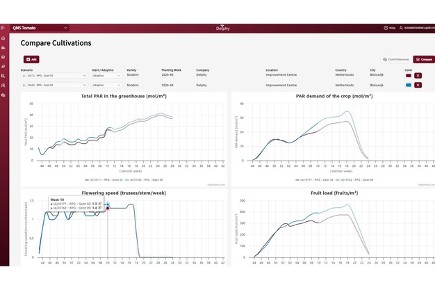
The "Compare Crops" page offers a variety of comparison options that cater to the diverse needs of its users. Farmers can now compare the Start versus the Adaptive Strategy within a single scenario, analyze multiple scenarios for a single crop, and even compare different crop years within the same company. Additionally, the tool allows for comparisons between crops grown in different locations or by different companies. This flexibility provides users with a comprehensive view of their operations, enabling them to identify trends, predict outcomes, and implement strategies that align with their specific goals and conditions.
 © Delphy
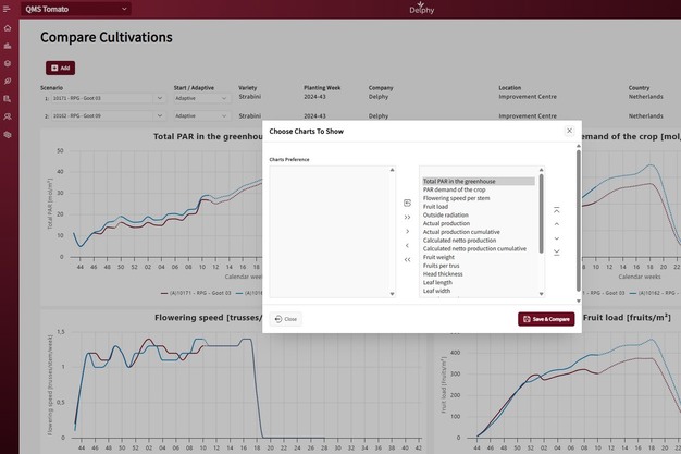
To enhance the user experience, the new functionalities include the ability to choose up to ten scenarios for comparison, customize line colors for each scenario, and select either the Start or Adaptive Strategy for each scenario. Users can also determine which graphs to compare and their order through a preferences button.
 © Delphy
The display features a user-friendly interface where the starting week is displayed on the X-axis, with dotted lines indicating predictions and solid lines showing realized values. By hovering over the graph, users can view specific weekly values, while the legend allows them to toggle lines representing different strategies. These enhancements aim to provide users with a powerful tool to visualize and analyze their data, ultimately leading to more strategic and successful farming practices.
 Delphy